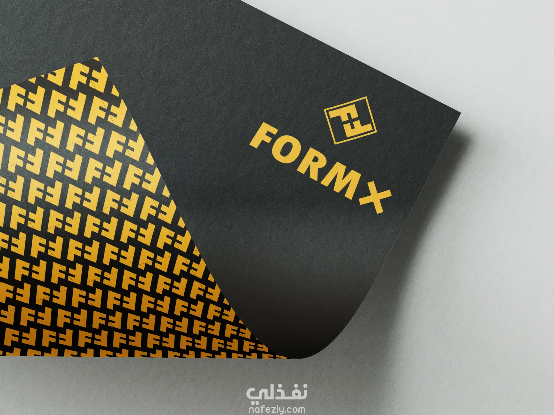
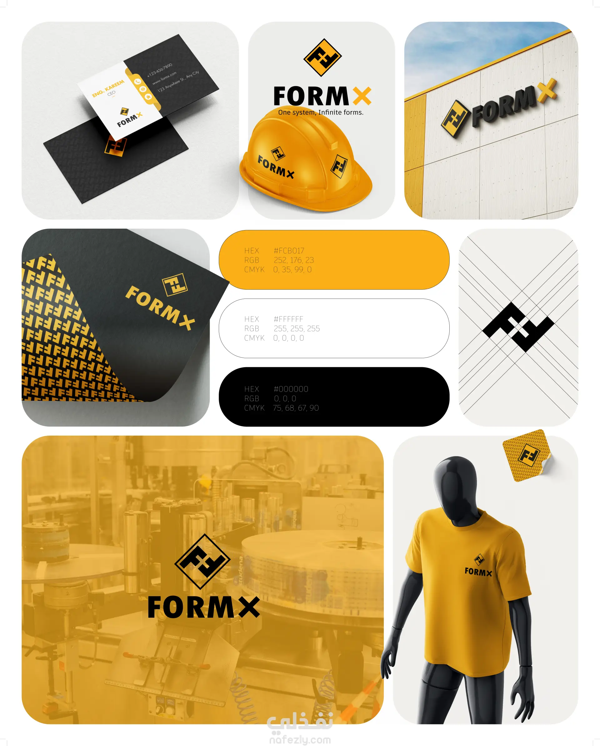
يعتمد تصميم لوجو FormX على فكرة بسيطة وذكية تعكس جوهر عمل الشركة، وهي القدرة على تصنيع عبوات بأي شكل وبأي درجة من التعقيد.
يتكوّن الرمز من حرفي F متقابلين، في إشارة إلى كلمة Form، بينما يتكوّن الفراغ بينهما ليشكّل حرف X، والذي يرمز إلى التنوع واللامحدودية وإمكانية إنتاج أي شكل.
يعتمد التصميم على التفاعل بين الكتلة والفراغ لإيصال فكرة التحوّل والتشكيل، حيث يعبّر عن انتقال الشكل من فكرة إلى منتج نهائي. كما يعكس الأسلوب الهندسي القوي الدقة الصناعية، بينما يحافظ الطابع المجرد على حداثة الهوية ومرونتها.
يتجنّب اللوجو تمثيل نوع محدد من العبوات، ليبقى معبّرًا عن جميع الأشكال، مما يعزّز رسالة العلامة التجارية:
FormX تصنع أي شكل.
The FormX logo is built on a smart and minimal concept that reflects the company’s core idea: creating limitless packaging forms.
The icon is constructed using two mirrored “F” shapes, representing the word Form. The negative space between them forms an “X”, symbolizing flexibility, unknown possibilities, and the ability to produce any shape regardless of complexity.
This interplay between solid and void visually communicates the transformation process — where structure meets creativity. The geometric, bold style reflects precision and industrial strength, while the abstract form keeps the identity modern and innovative.
The design avoids representing a specific type of container, allowing it to stand for all forms of packaging, reinforcing the brand promise:
FormX creates any form.