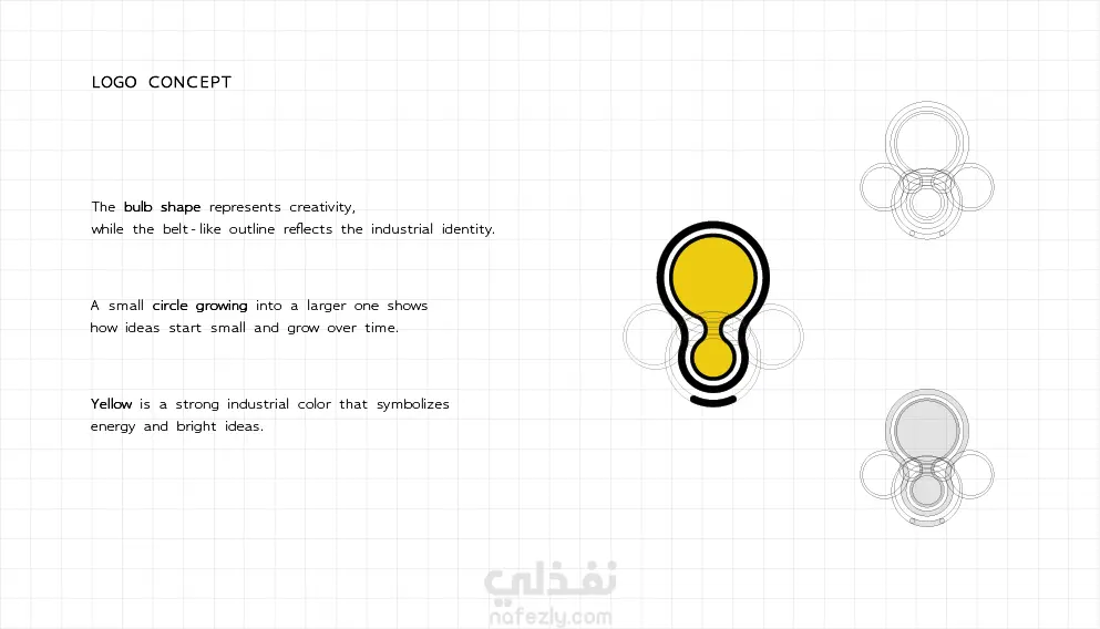
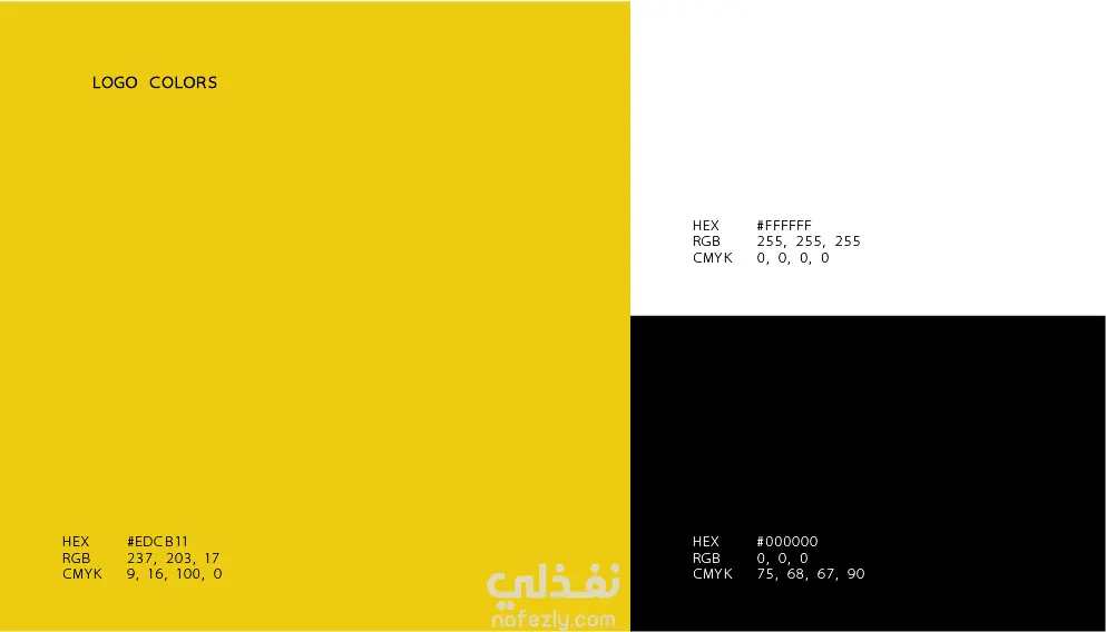
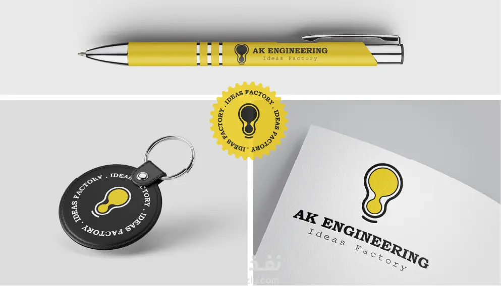
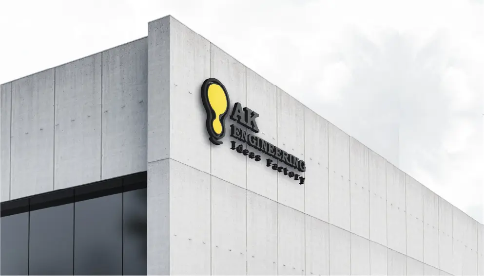
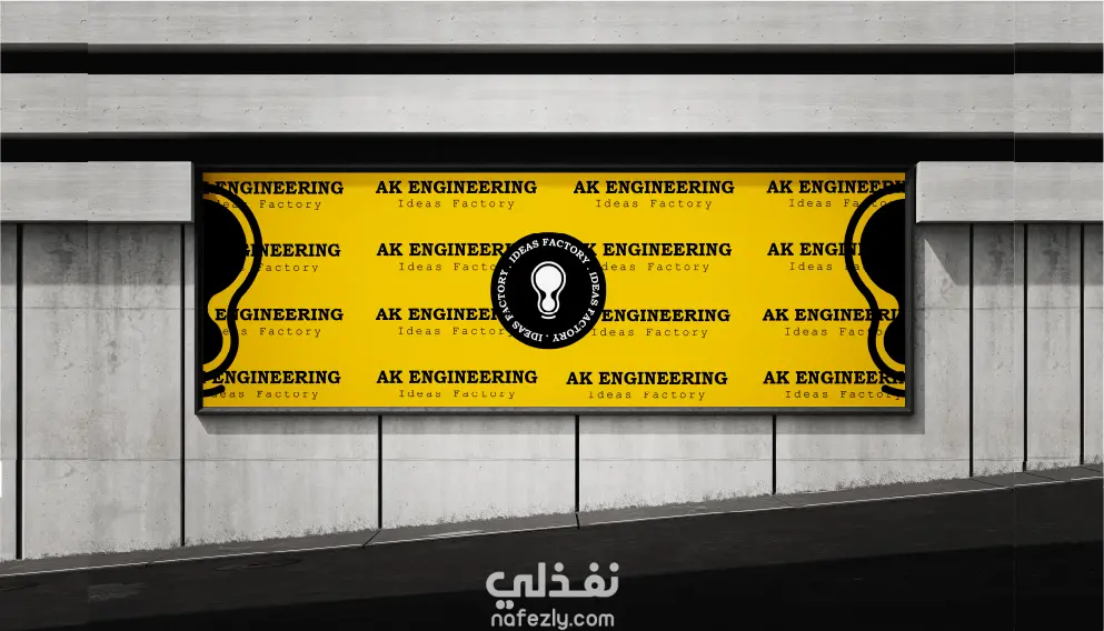
تم تصميم شعار AK Engineering مستوحى من مفهوم الإبداع والهوية الصناعية. حيث يأخذ الشكل الخارجي هيئة لمبة كدلالة على الأفكار والابتكار، مع تبسيطها لتشبه سير نقل الحركة، مما يعكس الطابع الهندسي والصناعي للمشروع. تم اختيار اللون الأصفر للتعبير عن الطاقة والوضوح، بالإضافة إلى الإيحاء بوجود فكرة مضيئة. في الداخل، تعبر دائرة صغيرة تتوسع إلى دائرة أكبر عن فكرة أن البداية تكون بسيطة ثم تنمو وتتطور مع الوقت لتصبح أكثر تأثيرًا. كما تم استخدام خط حاد وقوي ليعكس بيئة العمل الصناعية ويعبر عن القوة والدقة والاحترافية. بشكل عام، يجمع الشعار بين الإبداع والهندسة ليجسد مفهوم “مصنع الأفكار”.
The logo of AK Engineering is inspired by the concept of creativity and industrial identity. The outer shape is designed as a light bulb, symbolizing ideas and innovation, while its form is subtly adapted to resemble a motion belt, reflecting the engineering and industrial nature of the brand. The use of yellow emphasizes energy, visibility, and the presence of a bright idea, reinforcing the concept of illumination and creativity. Inside the logo, a small circle expanding into a larger one represents how ideas begin small and grow over time into impactful solutions. Additionally, the sharp and bold typography complements the industrial environment, conveying strength, precision, and professionalism. Overall, the logo combines creativity and engineering to express the essence of an “Ideas Factory.”